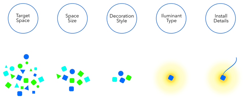
To get a clear vision and a better understanding of what do customers care about when purchasing lightings, we made several field researches to the philips retail store, so that we are able to engage with customers, have a conversation with them, and then summarize their thoughts.
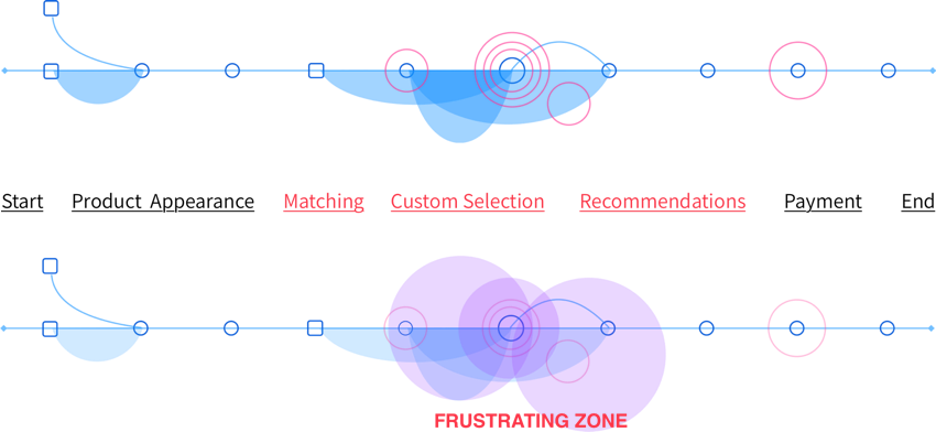
When it comes to the current online shopping expeience, we chose customer journey map as the tool to evaluate customers’ main frustrations through the whole purcahsing process.
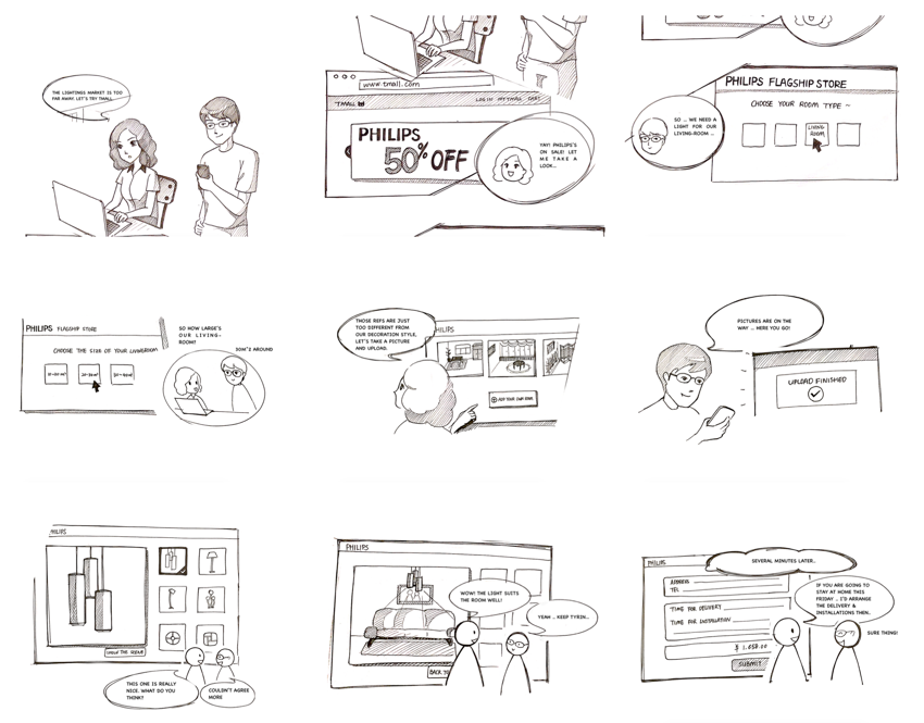
In order to achieve a visionary customer journey, a series of visual storyboards was made to describe the complete process of using Lighting Room Mobile.
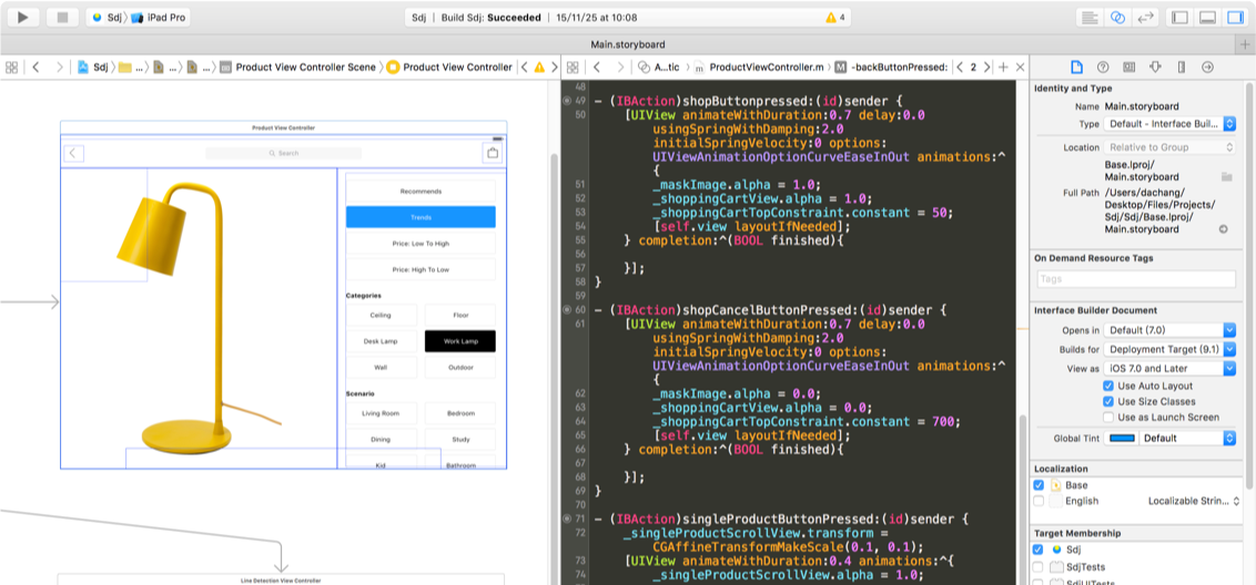
“No designer wants to spend weeks putting together something only to be told that it can’t be done.” Once I came out with the initiative satisfying design, I soon started developing the demo application then iterated with design together.
After finished develop the beta verision of Lighting Room Mobile, I archived the app then tested it among 35 fellow students on the workshop, gathered their feedback as the motivation to polish the product.